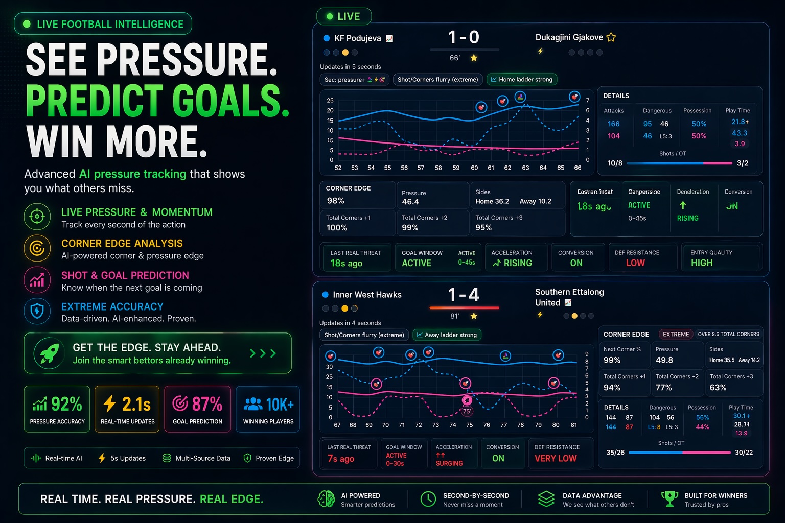
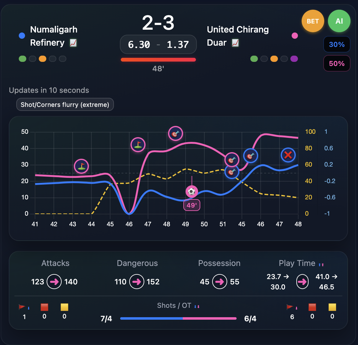
Match days
Pressure Graphs are the game drawn as lines: solid blue and pink for each team’s pressure, matching dashed lines for how hard they’re pushing in attack (penetration), plus shots and corners on the same timeline. It updates as the match runs. No magic — just less tab-hopping than doing it in your head.
Stuff happens minute by minute. When one team starts to run the game, their solid line climbs and the dashed line usually wakes up too. Shots and corners show up where they happened. Scrub back a bit and you can see how the half felt, not just who scored.
Dangerous attacks
Those
dotted bits? Roughly “who’s stepping on the gas right now.”
Corners & stops
Corners
sit on the line so you spot messy spells without digging through a feed.
Shots on the chart
On
and off target, pinned to the minute. Beats scrolling a stats block.
Live data comes in, the chart redraws. You’re not staring at raw numbers — you’re looking at who’s got the upper hand and whether someone’s ramping up properly or just knocking it around.
Attacks, dangerous actions, possession — the usual stuff you’d care about if you were trying to feel the swing of the game.
That mess gets smoothed into minute-by-minute pressure for each team, plus the dashed penetration traces so you see extra threat, not just possession noise. One screen.
Blue for the home side, pink for away — you can tell who’s leaning on the game without a spreadsheet.
One timeline: two solid pressure lines (home / away), two dashed penetration lines, and the usual shot and corner markers. We don’t spam you with alerts — you watch the chart and make your own read.
What people have open when the ref blows — curves, dashes, markers, same page.
If blue pulls away from pink, you know who’s bossing it. When the dashed lines jump with corners and shots piling up, that’s often a goal window brewing — sometimes before the stands really clock it.
0-0 snoozer or end-to-end chaos — you still see where it’s getting tight. No studio hot takes required.
Bunch of 🎯 markers, solid lines climbing, dashes getting busy? Usually worth paying attention — we call that a busy goal window.
Sign up if you need access, log in if you’ve already got it, then park the graph next to whatever you’re watching. Second screen, laptop, tablet — whatever works for you.